Cardgame Coalition

Would you like to react to this message? Create an account in a few clicks or log in to continue.

+2
Ashiok
Jordan, Lich Lord
6 posters

    Changes to the Card Frame (Waste Not and Wall of Fire M15)

    Jordan, Lich Lord
    Jordan, Lich Lord
    Legendary Member
    Legendary Member


    Posts : 8213
    Rep : 45
    Join date : 2012-04-05
    Age : 28

    Changes to the Card Frame (Waste Not and Wall of Fire M15) Empty Changes to the Card Frame (Waste Not and Wall of Fire M15)

    Post by Jordan, Lich Lord Mon Jan 06, 2014 5:40 am

    Changes to the Card Frame (Waste Not and Wall of Fire M15) 1521452_10151790266750448_871637824_nChanges to the Card Frame (Waste Not and Wall of Fire M15) 1463895_10151790266825448_986582150_n


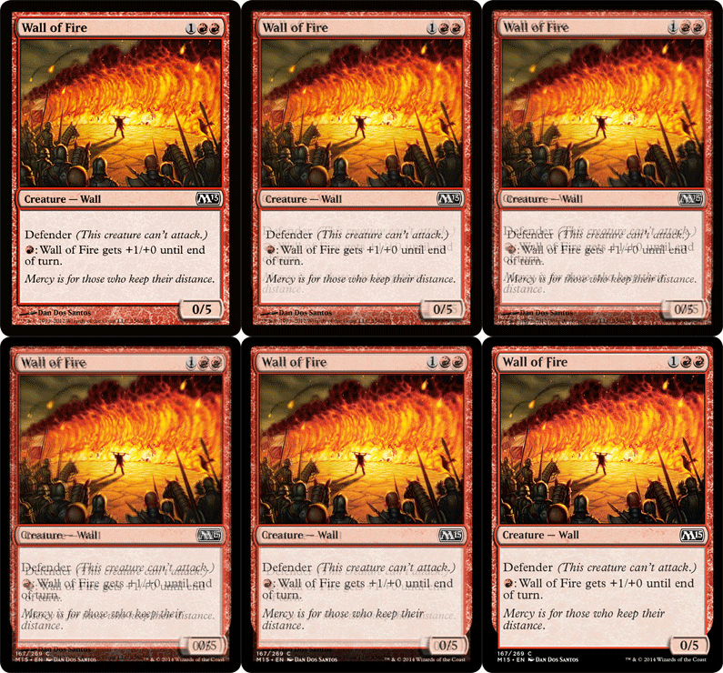
    Rares and Mythics will have an oval holo thing. The font has been changed, and the borders have been decreased by a small amount to allow more space.

    The bottom of each card is black now.

    All in all, I'd say this is nice, allows more text on cards.
    Ashiok
    Ashiok
    Moderators
    Moderators


    Posts : 3549
    Rep : 31
    Join date : 2012-04-04
    Age : 29
    Location : A flying tea saucer.

    Changes to the Card Frame (Waste Not and Wall of Fire M15) Empty Re: Changes to the Card Frame (Waste Not and Wall of Fire M15)

    Post by Ashiok Mon Jan 06, 2014 6:44 am

    Well.... eh.

    All I got from this is a barely noticeable border change and a junk rare in M15.

    Don't get me wrong, I don't dislike the change, it just doesn't seem to do much. Still looks very elegant though and it's not like it's worse than before.
    Rodrigo
    Rodrigo
    Admin
    Admin


    Posts : 5430
    Rep : 76
    Join date : 2012-04-03
    Age : 31
    Location : Maringá - Paraná - Brazil

    Changes to the Card Frame (Waste Not and Wall of Fire M15) Empty Re: Changes to the Card Frame (Waste Not and Wall of Fire M15)

    Post by Rodrigo Mon Jan 06, 2014 12:52 pm

    MtG players are usually scared of changes, but they end up adapting.

    I personally like the diamond of Rares and Mythics, it adds another special touch to them.

    And thinner card frame is a great addition!
    .Rai
    .Rai
    Elite Member
    Elite Member


    Posts : 1639
    Rep : 26
    Join date : 2012-04-05
    Age : 27
    Location : London, England

    Changes to the Card Frame (Waste Not and Wall of Fire M15) Empty Re: Changes to the Card Frame (Waste Not and Wall of Fire M15)

    Post by .Rai Mon Jan 06, 2014 3:21 pm

    Hmm, interesting news. Some thoughts.

    - A holofoil stamp is a clever idea. Stops counterfeiting, and is good unobtrusive design.
    - Waste Not's flavour text is gross. At least stick in a full stop.
    - New font's alright. It's just a slightly more geometric version of Matrix Bold. But, seriously, that F is going to annoy me all the time now. I hope there aren't other weird, decorated letters like that. Also, typical of them to call their font Beleren.
    - Borders: thumbs up. It's a little bold and new for me, but it's pretty gorgeous stuff. Modernised.

    Time for me to completely change up my custom template.
    Jordan, Lich Lord
    Jordan, Lich Lord
    Legendary Member
    Legendary Member


    Posts : 8213
    Rep : 45
    Join date : 2012-04-05
    Age : 28

    Changes to the Card Frame (Waste Not and Wall of Fire M15) Empty Re: Changes to the Card Frame (Waste Not and Wall of Fire M15)

    Post by Jordan, Lich Lord Mon Jan 06, 2014 7:41 pm

    After sleeping on it, I really really like the al black on the bottom of the card Smile Makes them look sleek or something
    Rodrigo
    Rodrigo
    Admin
    Admin


    Posts : 5430
    Rep : 76
    Join date : 2012-04-03
    Age : 31
    Location : Maringá - Paraná - Brazil

    Changes to the Card Frame (Waste Not and Wall of Fire M15) Empty Re: Changes to the Card Frame (Waste Not and Wall of Fire M15)

    Post by Rodrigo Mon Jan 06, 2014 11:31 pm

    It's not symmetrical though, so OCD MtG players might be in trouble.
    Dae of Judgment
    Dae of Judgment
    Elite Member
    Elite Member


    Posts : 1792
    Rep : 22
    Join date : 2012-04-04
    Age : 27

    Changes to the Card Frame (Waste Not and Wall of Fire M15) Empty Re: Changes to the Card Frame (Waste Not and Wall of Fire M15)

    Post by Dae of Judgment Tue Jan 07, 2014 2:49 am

    .Rai wrote:Hmm, interesting news. Some thoughts.
    Time for me to completely change up my custom template.
    It is the same thing for me. However, that is more fun than making actual cards.

    Mirai wrote:It's not symmetrical though, so OCD MtG players might be in trouble.
    You're talking about horizontal symmetry, right? Otherwise, it is symmetrical. It kind of reminds me of planeswalker frames because of how it looks. But still bothersome with symmetry, I have to agree with you on that.
    Dae of Judgment
    Dae of Judgment
    Elite Member
    Elite Member


    Posts : 1792
    Rep : 22
    Join date : 2012-04-04
    Age : 27

    Changes to the Card Frame (Waste Not and Wall of Fire M15) Empty Re: Changes to the Card Frame (Waste Not and Wall of Fire M15)

    Post by Dae of Judgment Wed Jan 08, 2014 10:48 pm

    Changes to the Card Frame (Waste Not and Wall of Fire M15) Tumblr_mz2jn4W1sZ1qblxj7o1_400
    Rodrigo
    Rodrigo
    Admin
    Admin


    Posts : 5430
    Rep : 76
    Join date : 2012-04-03
    Age : 31
    Location : Maringá - Paraná - Brazil

    Changes to the Card Frame (Waste Not and Wall of Fire M15) Empty Re: Changes to the Card Frame (Waste Not and Wall of Fire M15)

    Post by Rodrigo Wed Jan 08, 2014 11:57 pm

    Seeing this gif makes me like the changes. The cards look more... "magical" to me.
    Kyousuke Kousaka
    Kyousuke Kousaka
    Elite Member
    Elite Member


    Posts : 1116
    Rep : 4
    Join date : 2012-05-01
    Age : 30
    Location : Above your garage.

    Changes to the Card Frame (Waste Not and Wall of Fire M15) Empty Re: Changes to the Card Frame (Waste Not and Wall of Fire M15)

    Post by Kyousuke Kousaka Thu Jan 09, 2014 4:15 am

    It's a slight zoom with a bit of a border change.

    I like it.
    Dae of Judgment
    Dae of Judgment
    Elite Member
    Elite Member


    Posts : 1792
    Rep : 22
    Join date : 2012-04-04
    Age : 27

    Changes to the Card Frame (Waste Not and Wall of Fire M15) Empty Re: Changes to the Card Frame (Waste Not and Wall of Fire M15)

    Post by Dae of Judgment Thu Jan 09, 2014 4:53 am

    Also take note of the change of the font in the name of the card. But that was also previously mentioned.


    The Mana Cost and Type - Subtype are going to be higher. The text in the Rules/Flavor area is bigger, and the textbox is as well.

    The P/T Box is smaller in length by about 10-15 pixels. 

    And the border is more rounded like the corners when it means the card.

    Actually, I am having fun redoing my template.
    Ashiok
    Ashiok
    Moderators
    Moderators


    Posts : 3549
    Rep : 31
    Join date : 2012-04-04
    Age : 29
    Location : A flying tea saucer.

    Changes to the Card Frame (Waste Not and Wall of Fire M15) Empty Re: Changes to the Card Frame (Waste Not and Wall of Fire M15)

    Post by Ashiok Thu Jan 09, 2014 6:11 am

    So, besides the F in the card name, it's a better frame.

    Ok then.
    Jordan, Lich Lord
    Jordan, Lich Lord
    Legendary Member
    Legendary Member


    Posts : 8213
    Rep : 45
    Join date : 2012-04-05
    Age : 28

    Changes to the Card Frame (Waste Not and Wall of Fire M15) Empty Re: Changes to the Card Frame (Waste Not and Wall of Fire M15)

    Post by Jordan, Lich Lord Thu Jan 09, 2014 8:05 pm

    Yeah, what the heck is with the F? Only thing I have the slightest problem with.
    Rodrigo
    Rodrigo
    Admin
    Admin


    Posts : 5430
    Rep : 76
    Join date : 2012-04-03
    Age : 31
    Location : Maringá - Paraná - Brazil

    Changes to the Card Frame (Waste Not and Wall of Fire M15) Empty Re: Changes to the Card Frame (Waste Not and Wall of Fire M15)

    Post by Rodrigo Thu Jan 09, 2014 8:22 pm

    I like the F, it adds to the medieval feel that MtG always had for me.
    Dae of Judgment
    Dae of Judgment
    Elite Member
    Elite Member


    Posts : 1792
    Rep : 22
    Join date : 2012-04-04
    Age : 27

    Changes to the Card Frame (Waste Not and Wall of Fire M15) Empty Re: Changes to the Card Frame (Waste Not and Wall of Fire M15)

    Post by Dae of Judgment Thu Jan 09, 2014 10:58 pm

    Jordan, Lich Lord wrote:Yeah, what the heck is with the F? Only thing I have the slightest problem with.

    Originally the Font used was Matrix Bold. They changed the font for something that was unique with it being edgy but still readable. They changed the font to a font called Beleren.

    Jordan, Lich Lord
    Jordan, Lich Lord
    Legendary Member
    Legendary Member


    Posts : 8213
    Rep : 45
    Join date : 2012-04-05
    Age : 28

    Changes to the Card Frame (Waste Not and Wall of Fire M15) Empty Re: Changes to the Card Frame (Waste Not and Wall of Fire M15)

    Post by Jordan, Lich Lord Fri Jan 10, 2014 12:06 am

    I know that part, but the F just looks....different then the rest of the font.
    Dae of Judgment
    Dae of Judgment
    Elite Member
    Elite Member


    Posts : 1792
    Rep : 22
    Join date : 2012-04-04
    Age : 27

    Changes to the Card Frame (Waste Not and Wall of Fire M15) Empty Re: Changes to the Card Frame (Waste Not and Wall of Fire M15)

    Post by Dae of Judgment Fri Jan 10, 2014 12:15 am

    The "W" as well, but take into account the capitals and non-capital letters.

    Sponsored content


    Changes to the Card Frame (Waste Not and Wall of Fire M15) Empty Re: Changes to the Card Frame (Waste Not and Wall of Fire M15)

    Post by Sponsored content


      Current date/time is Thu Nov 14, 2024 1:09 am